02 · Featured case study
Haven
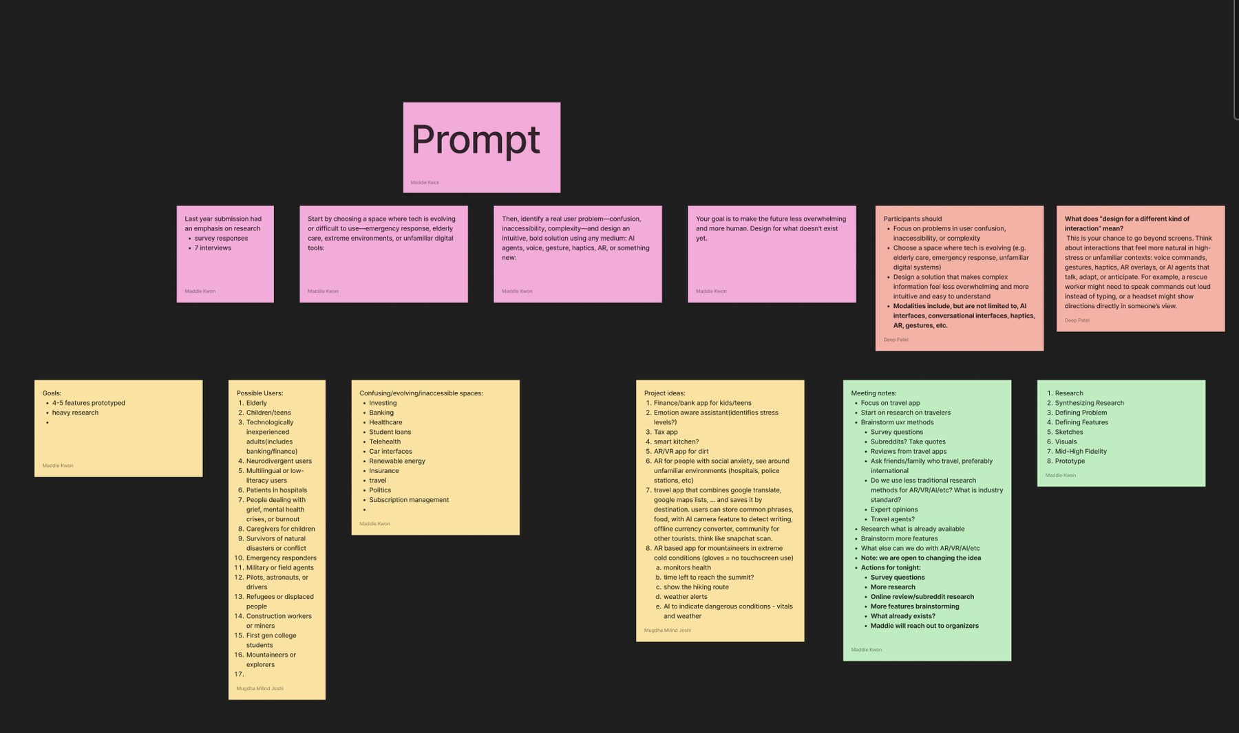
UX Research · Product Design · Information Architecture
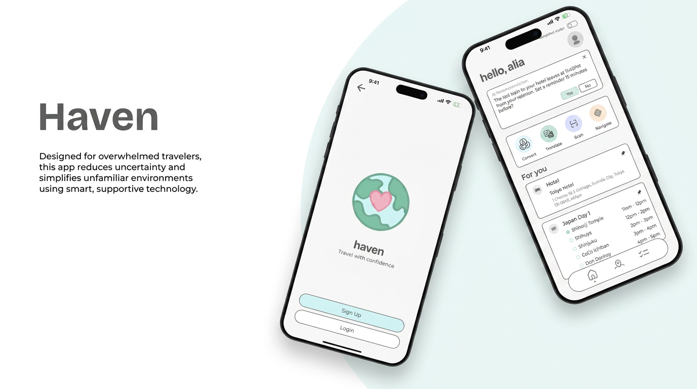
A travel app for overwhelmed travellers, Haven reduces uncertainty in unfamiliar places with AR navigation, an offline toolkit, and calm, anxiety-aware interfaces.
01
Context
Designed for overwhelmed travellers, Haven reduces uncertainty and simplifies unfamiliar environments using smart, supportive technology.
- Project
- Haven: UC Irvine Designathon
- Role
- UX Researcher & Product Designer
- Team
- Aasritha, Deep, Maddie, Mugdha
- Tools
- Figma, FigJam, Google Forms
- Platform
- iOS mobile app
- Responsibilities
- User interviews, survey design, synthesis, affinity mapping, persona, feature definition, wireframes, hi-fi screens
- Prompt
- Design for a space where technology is evolving or hard to use, make the future less overwhelming and more human
- Scope
- 4–5 features prototyped, research-heavy
02
Problem framing
The Designathon brief asked teams to pick a space where technology is evolving or difficult to use, identify a real user problem around confusion, inaccessibility, or complexity, and design a bold, intuitive solution using any modality, AI, voice, gesture, haptics, or AR.
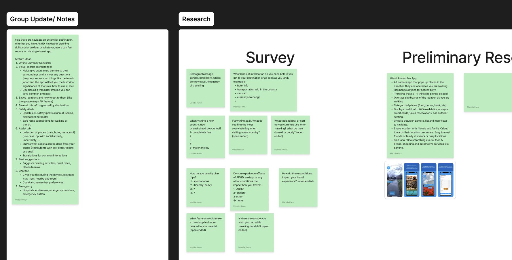
We mapped candidate users and spaces before committing, then chose travel: a context where people are already stressed, tools are fragmented, and the cost of confusion is immediate. The framing we settled on was helping travellers navigate an unfamiliar destination, whether they have ADHD, poor planning skills, social anxiety, or simply no local knowledge.
03
Research
Research ran in two tracks: semi-structured interviews with travellers and a survey distributed for breadth. We also audited existing tools to understand what travellers already patch together.
- Interviews
- 7 traveller interviews
- Survey
- Google Form responses on planning, anxiety, and tools
- Secondary
- Competitive audit of AR and travel apps
- Synthesis
- Affinity diagram → seven insight clusters
04
Insights
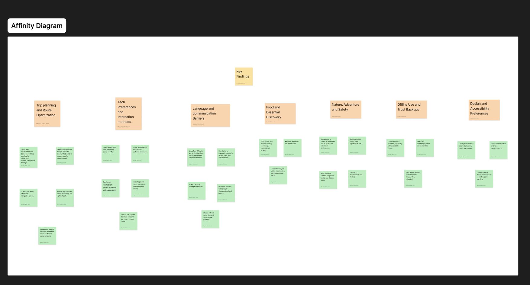
Clustering the raw notes produced seven themes. Each one became a constraint on the product rather than a feature request.
- Trip planning & route optimisation, Google Maps follows the order the itinerary was typed in, not the optimal real-time path; walking distances are inaccurate because step counts assume region-specific averages
- Tech preferences & interaction methods, users prefer phone scanning and voice assistants over VR; voice enables hands-free use while driving or walking
- Language & communication barriers, translation is needed most in stores, cafés, and conversations; users are anxious about talking to strangers and afraid of unknowingly disrespecting local culture
- Food & essential discovery, finding food that matches dietary needs and locating restrooms are recurring friction points
- Nature, adventure & safety, users travel to historical landmarks and nature spots, and want alerts for wildlife, dangerous paths, and slippery areas, plus rest zones during hikes
- Offline use & trust backups, offline maps are essential with a user-set radius; when technology fails, users ask trustworthy-looking locals
- Design & accessibility preferences, calming colours (dark mode, cream, earth tones) and a low-distraction UI for anxious or neurodivergent travellers
05
Persona
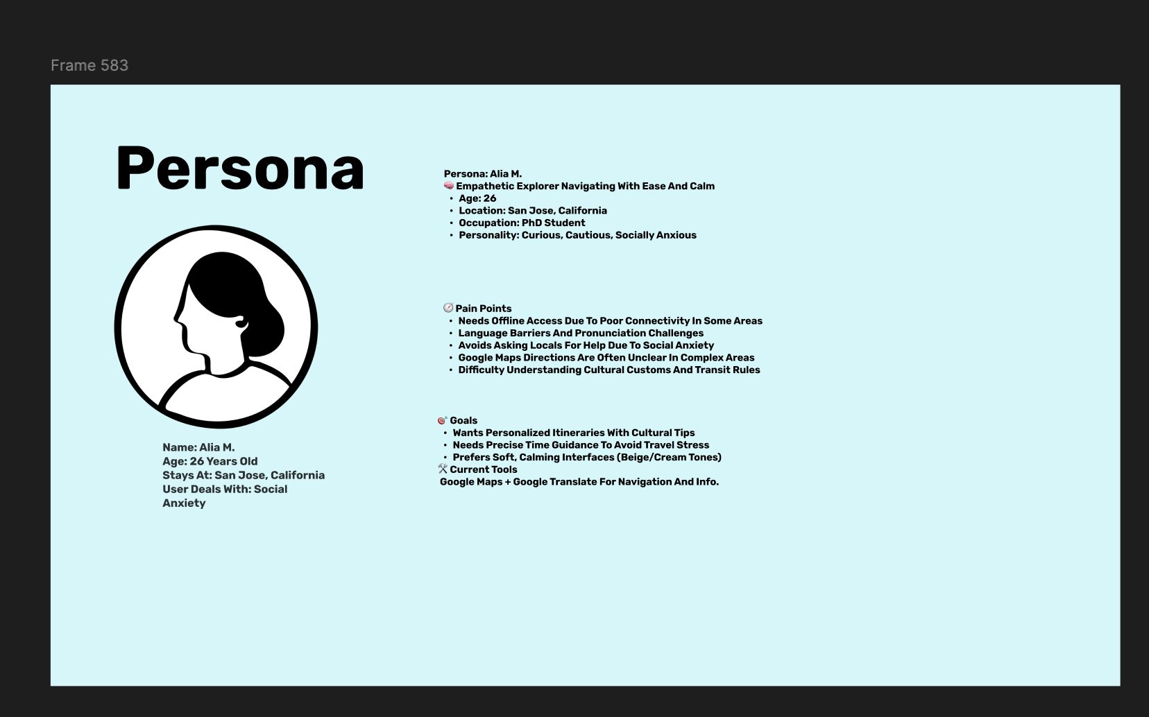
Alia M., 26, a PhD student in San Jose, curious, cautious, and socially anxious. She needs offline access in patchy areas, struggles with pronunciation, avoids asking locals for help, and finds Google Maps unclear in complex areas. She currently stitches together Google Maps and Google Translate.
06
Competitive analysis
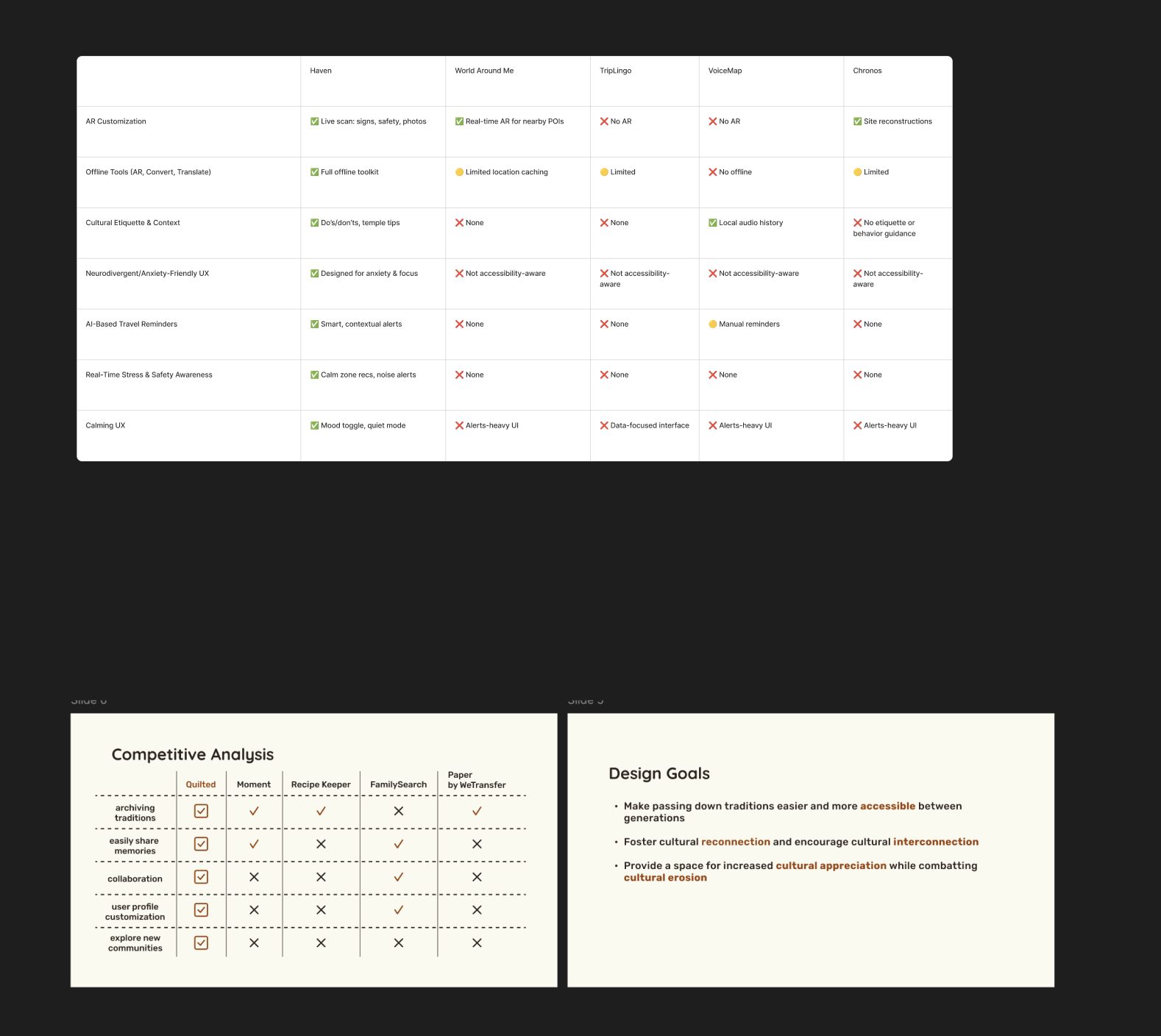
We compared Haven against World Around Me, TripLingo, VoiceMap, and Chronos. AR existed in the market and translation existed in the market, but no product combined a full offline toolkit, cultural etiquette guidance, contextual AI reminders, and a calm, neurodivergent-friendly interface.
07
Key decisions & architecture
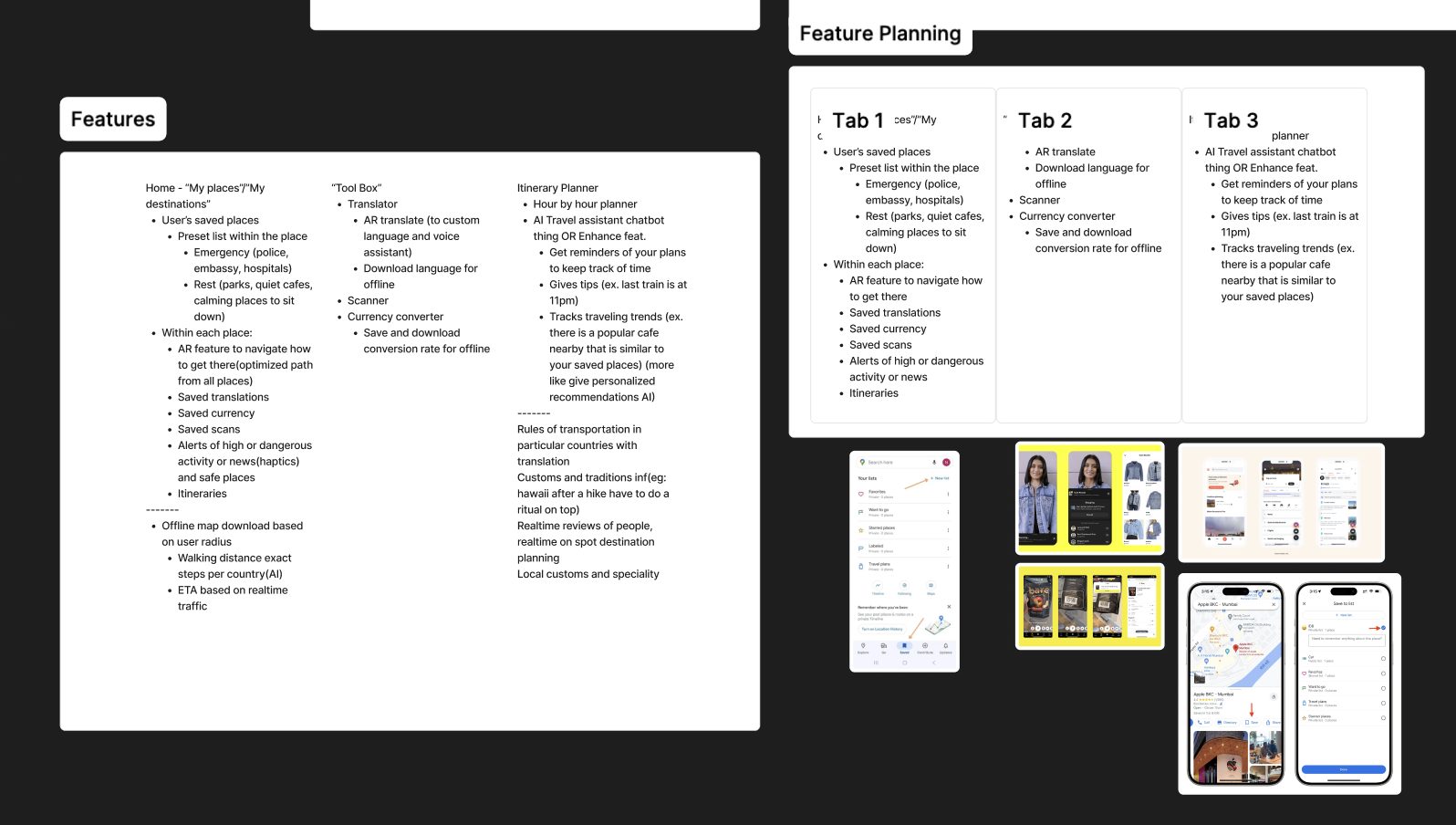
Features were grouped into three tabs so that everything a traveller might reach for under stress sits one tap away.
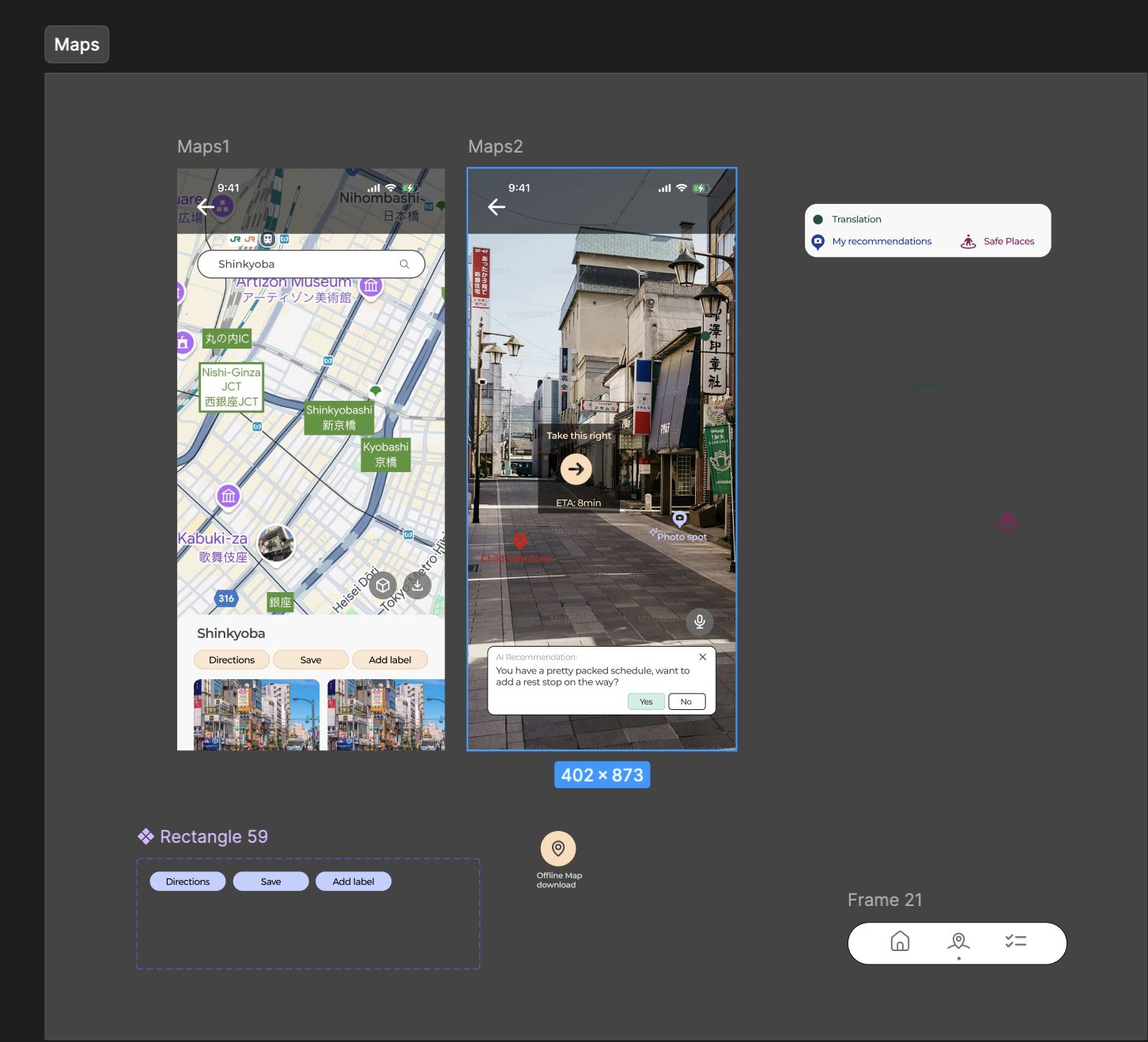
- My Places, saved destinations with per-place emergency contacts (police, embassy, hospitals), rest spots, AR navigation, saved translations, currency, scans, and safety alerts
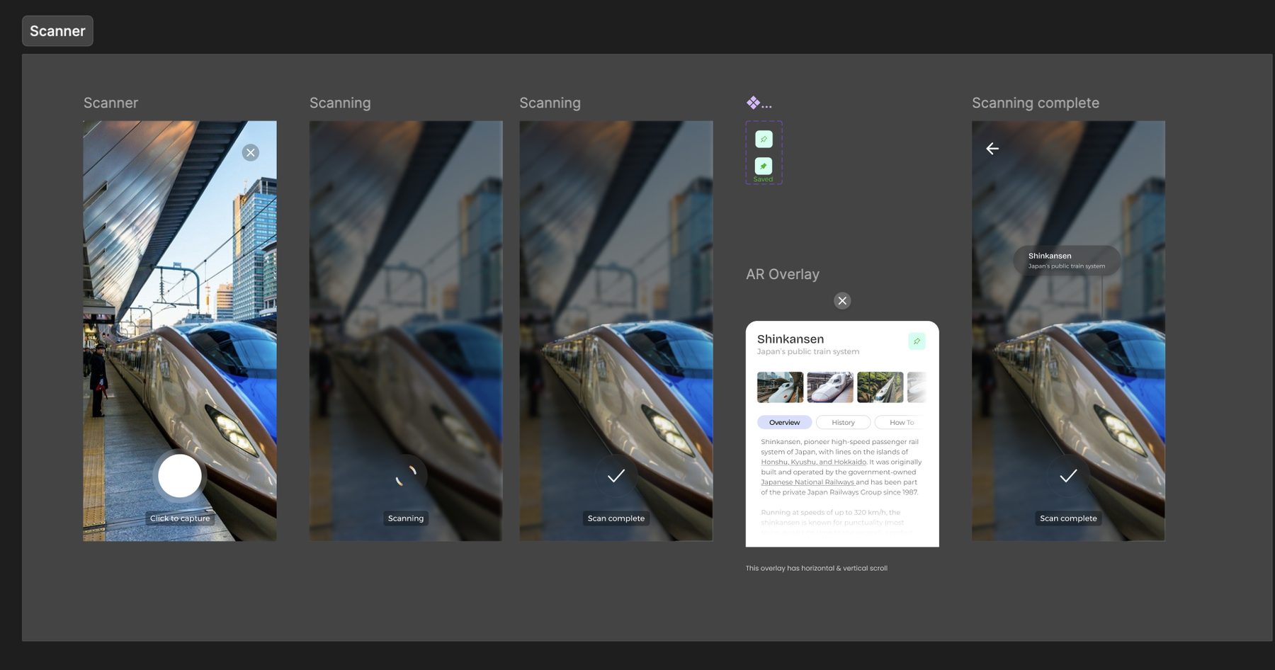
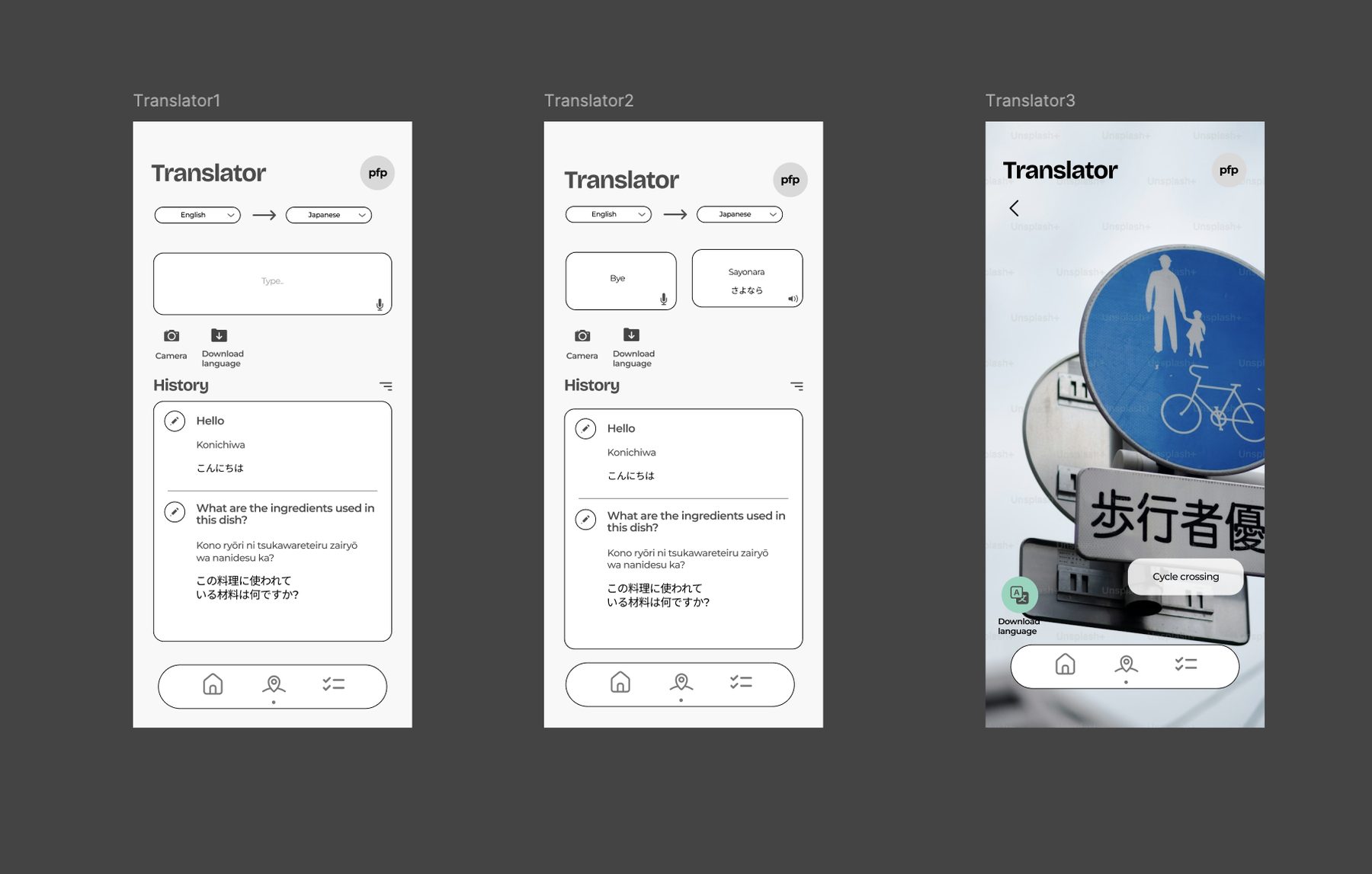
- Tool Box, AR translate with voice, downloadable offline languages, scanner, and an offline currency converter
- Planner, hour-by-hour itinerary, an AI travel assistant that reminds you of plans, surfaces tips such as last-train times, and tracks travel patterns for recommendations
08
Wireframes
Low-fidelity frames tested the tab structure before any visual design: home, translator, scanner, currency converter, safety lists, and the itinerary planner. A "Home, simplified" variant explored a reduced-stimulus layout for anxious users.
09
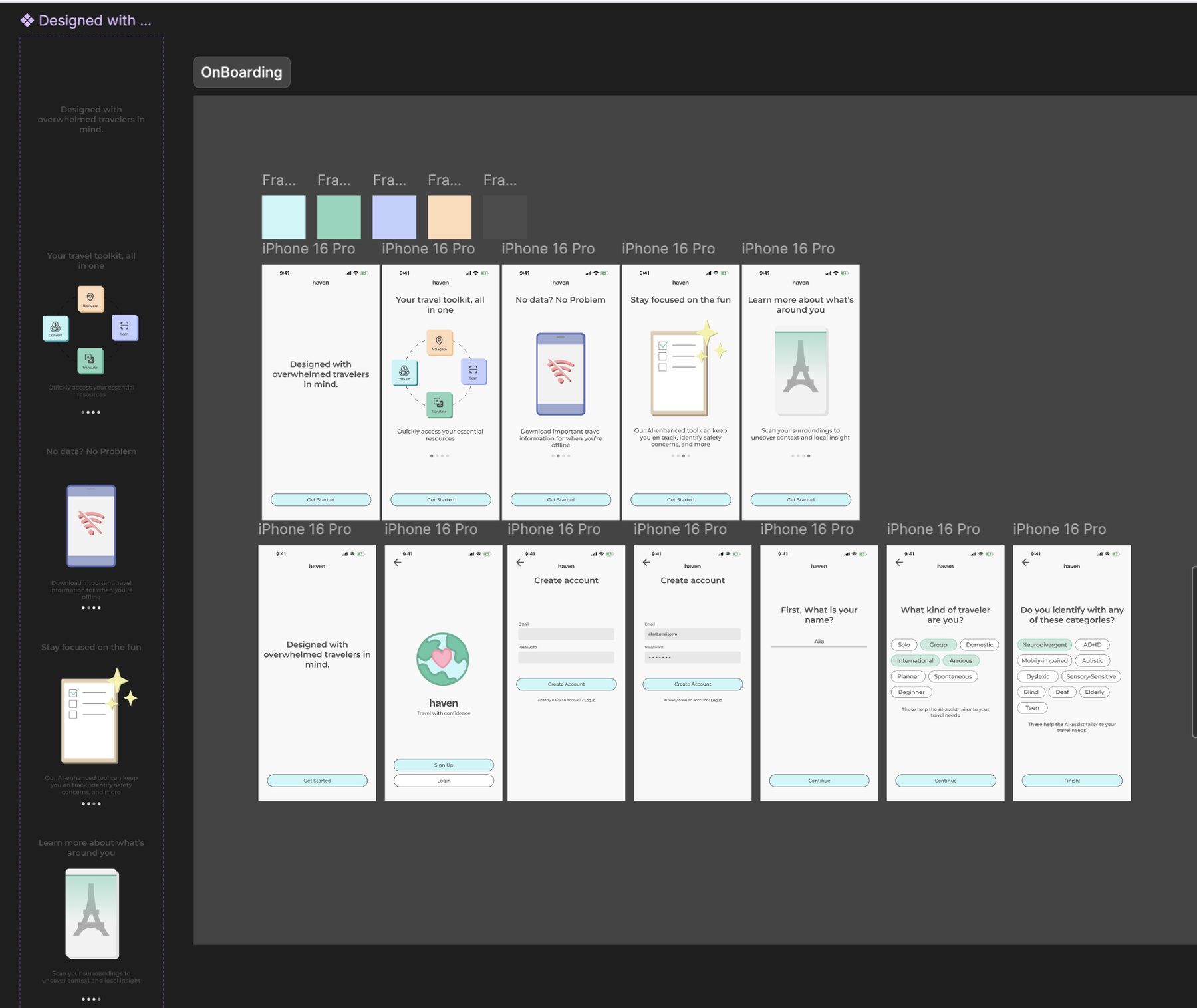
Screens
10
Presentation
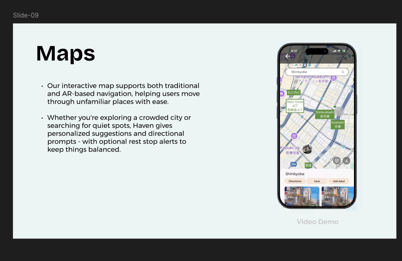
The final deck framed Haven for the Designathon panel: the traveller problem, the research behind it, and each feature demonstrated in context.
11
Reflection
- Accessibility first: traveller type and accessibility categories are collected during onboarding so the interface adapts rather than assuming a default user
- Offline is a feature, not a fallback: maps, languages, and conversion rates all download by user-set radius
- Calm over dense: mood toggle, quiet mode, and earth-tone palette came directly from research on anxious and neurodivergent travellers
The strongest lesson was how much the affinity diagram did. Seven clusters replaced a long list of feature ideas, and every later argument about scope could be settled by asking which cluster a feature served. Working to a hackathon timeline also forced early agreement on the three-tab structure, once that held, screens could be split across four designers without drifting.
Next · Project
JobScout→