01 · Featured case study
Skillogram
Mobile Design · UX Research · Gamification
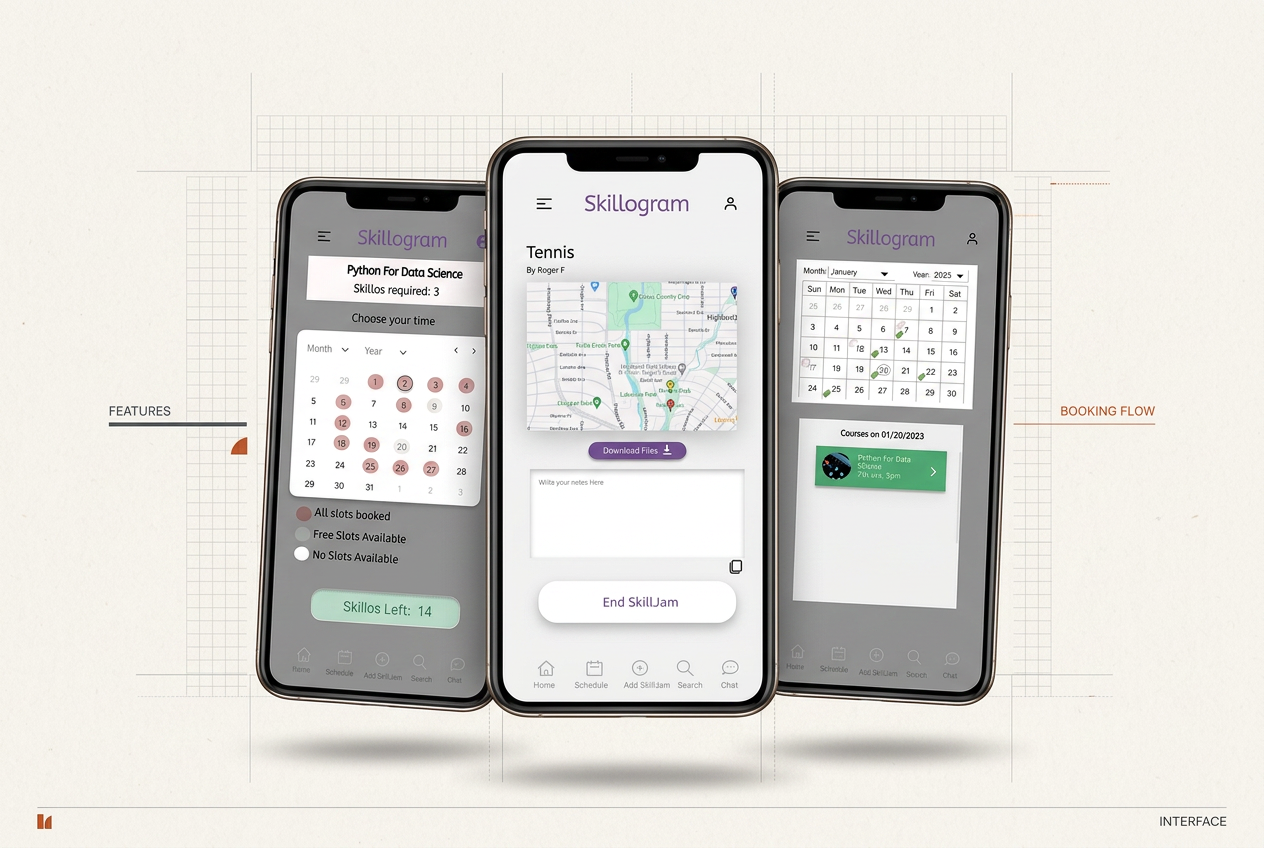
A fun, interactive app that brings students together to learn from each other, earning skill points for every session and interaction, so upskilling becomes rewarding and communal.
01
Context
Students in academia and industry face a real skill gap, and many struggle to find upskilling support inside their own peer networks, even though peers with valuable expertise are sitting right next to them. Skillogram creates the missing space where that exchange can happen.
- Project
- Skillogram
- Category
- Mobile design
- Type
- Case study
- Duration
- 5 months
- Role
- UX Designer
- Tools
- Balsamiq, Figma
- Context
- NC State University
- Responsibilities
- User interviews, personas, comparative study, wireframing, user study design, usability testing, A/B testing, data analysis, high-fidelity design
02
Background
The expertise students need is already around them, it just has nowhere to go.
The gap
Students in academia and industry hit a skill gap that slows their professional growth.
The blocker
They want to upskill, but find little practical support inside their own peer groups.
The untapped supply
Peers with real expertise in coding, design, or finance are eager to teach, with no place to do it.
Without a shared space, that exchange never happens, and a collaborative community stays potential rather than practice.
03
Why this project
Same building, same gaps, no easy way to connect the people who want to learn with the people who can teach.
- Coursework sat far from real-world skills
- Peers had motivation, but no guidance or access
- Expertise existed, with no structured way to share it
- Learning alone skips the part that helps: collaboration
04
Problem
How can we bring together students eager to learn and people willing to teach, in a community that closes the skill gap?
No structured exchange
Nothing connects learners with the peers who could mentor them.
Effort without payoff
Teaching a peer is unrecognised, so willing mentors rarely start.
Fragmented discovery
Finding who knows what, and when they are free, is guesswork.
Isolated learning
Solo courses leave students without feedback or accountability.
05
Research approach
User-centred from the first week: talk to students, study the alternatives, put structure in front of them early.
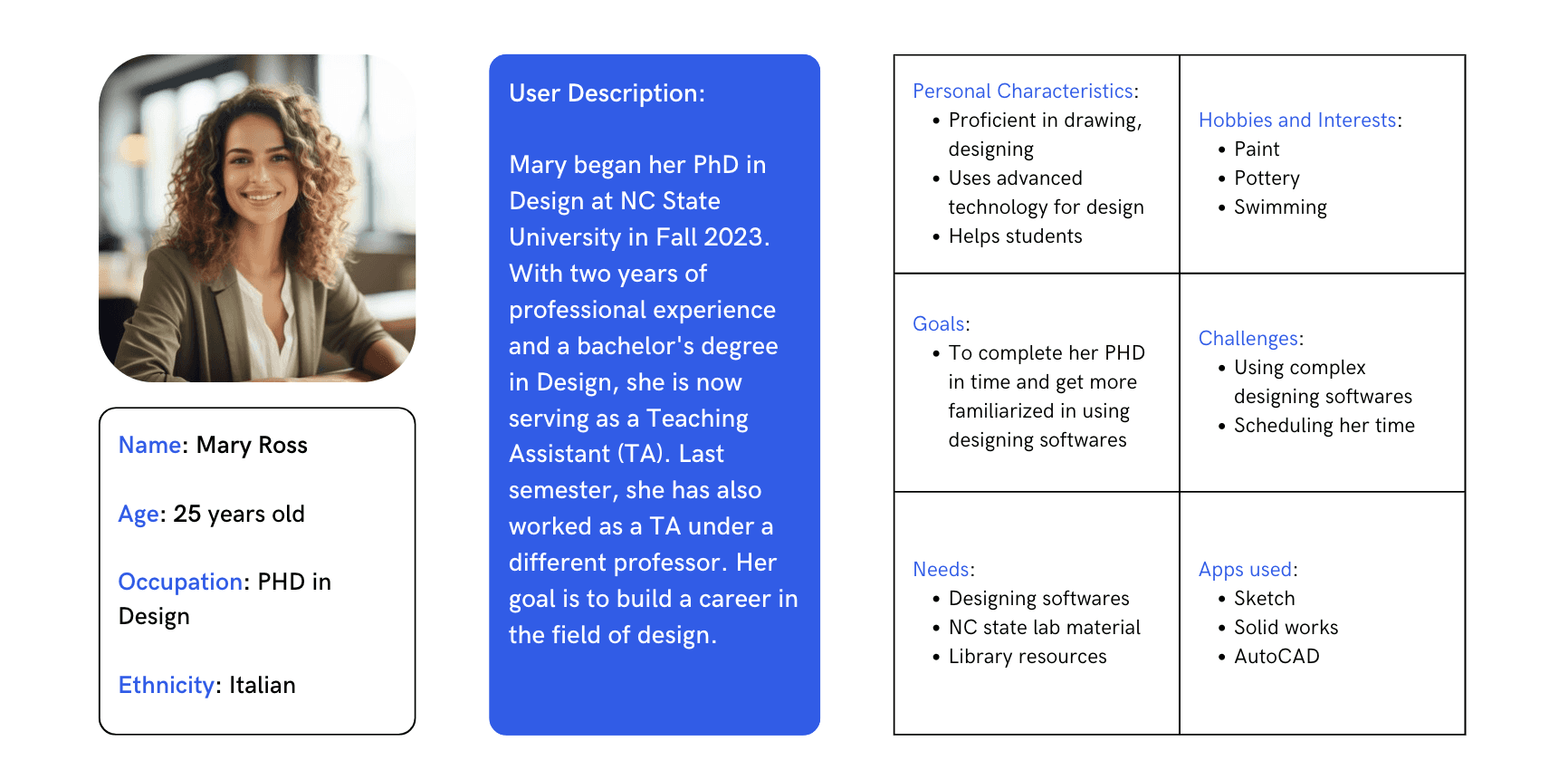
- Interviews with a diverse group of students across NC State University, turned into personas
- Comparative study of Coursera and Udemy to locate the gaps in existing platforms
- Balsamiq wireframes of the core features, tested with students for feedback
- Usability and accessibility checks folded into each iteration
06
Insights & testing
Study design
Clear hypotheses with metrics: time per session, interactions, and ease of use.
Testing
Wizard of Oz sessions for live feedback, plus A/B tests on competing variants.
Validation
Descriptive statistics, mean, median, SD, and error of the mean, behind each decision.
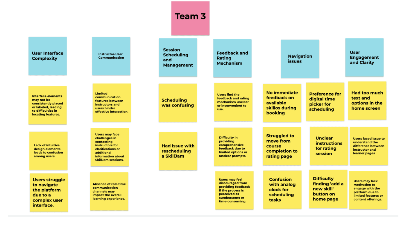
What testing surfaced
- Users struggled to navigate the platform due to a complex interface, with inconsistently placed elements
- Limited instructor–learner communication features hindered effective interaction
- Scheduling was confusing, and rescheduling a SkillJam was difficult
- The feedback and rating mechanism felt unclear and inconvenient to use
- No immediate feedback on available skillos during booking, and moving from course completion to the rating page was hard
- Preference for a digital time picker over the analog clock, and too much text and options on the home screen
07
Wireframes
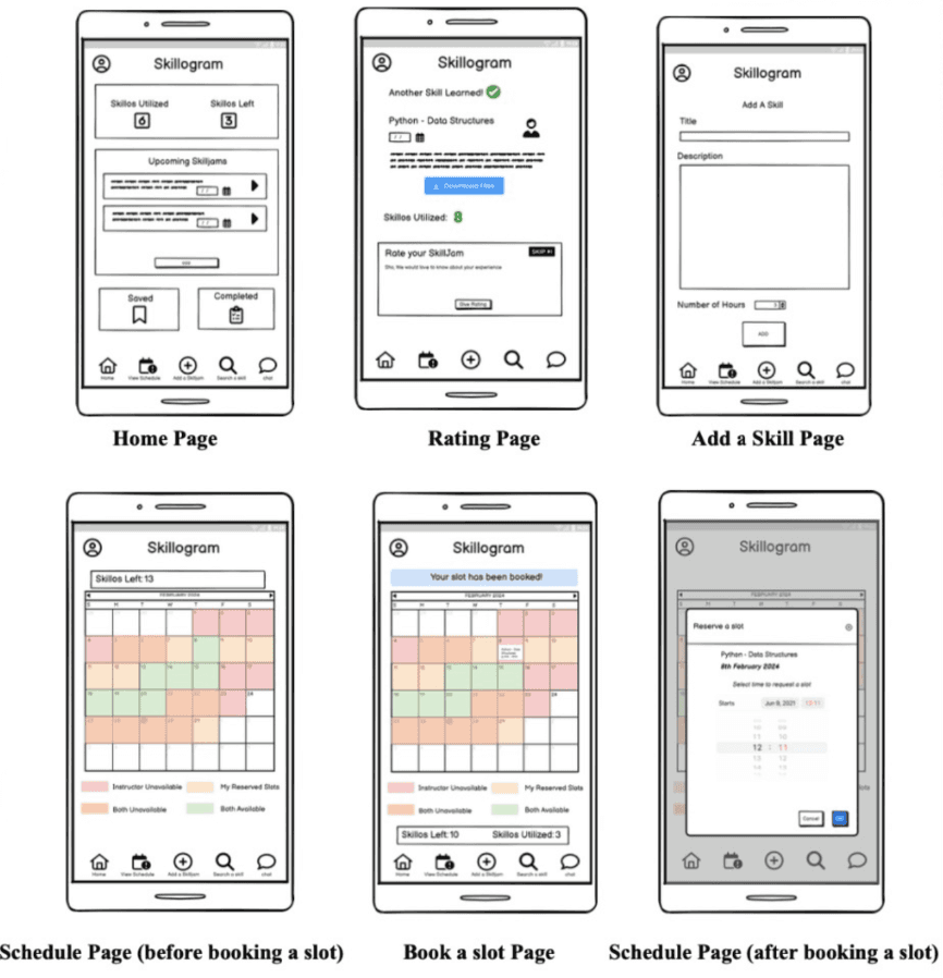
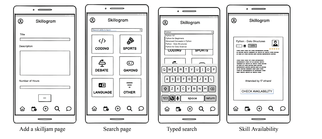
Wireframes built in Balsamiq mapped the core loop: find a skill, check availability, book a slot, run the SkillJam, and rate it, with skillos tracked throughout.
08
Final design
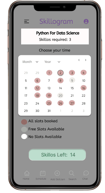
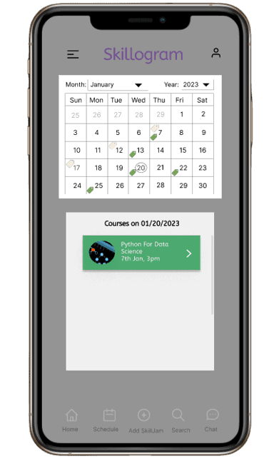
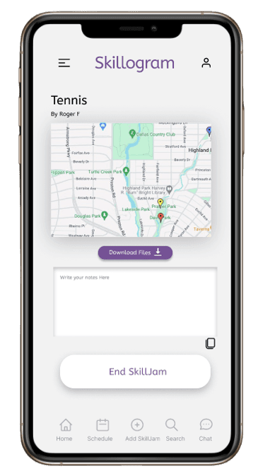
The final interface keeps discovery, scheduling, and progress one tap apart. A digital date picker replaced the analog clock, availability is colour-coded before booking, and skillos remain visible so learners always know where they stand.
09
Reflection
Every bit of feedback was valuable. By continuously iterating on the design and observing user interactions, I was able to optimise the platform, making it more user-friendly and aligned with the real needs of the users.
The process was not just about creating a platform; it was about truly listening to the users and ensuring that their voices were reflected in every aspect of the design.
Next · Featured case study
Haven→